Archive
Windows 8 XAML Introduction
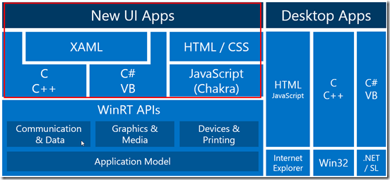
There are many ways to create Windows 8 New UI Apps. They can be based on HTML5 and Javascript or XAML and any .NET language.
Here is a small overview, what technologies a developer can use on Windows 8 for New UI Apps:
In this post i’m focusing on XAML with C#. It is helpful, if you have some experience in XAML based environments like Silverlight, WPF or Windows Phone 7 (which is Silverlight).
If you’ve never used one of this environments, no problem, just hang on.
For my experience, the best thing to learn a technology is to use it. For this reason, i’ll walk you through the necessary steps to create a very minimalistic Windows 8 app, which we’ll then improve step by step.
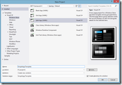
Step 1: Open VS 2012 and create a new "Windows Store" app:
Select the Split app (XAML) template from File-New Project dialog:
Then press F5 to start the app in the debugger.
If you do this the first time, then VS 2012 will prompt you for a Microsoft account and the password to create a free developer license for this account. This allows to create, debug and run your own created apps to run on any machine, where you are logged in with this Microsoft account.
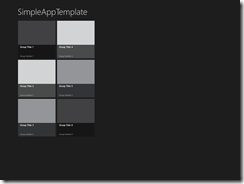
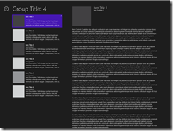
The app will look like this and allows to dive into any of the categories on the first page to see the linked details on the second page.
There is already a lot of functionality in this template, which might be confusing if you are new to XAML. Therefore we’ll get rid of some parts and start from an even simpler app:
Step 2: Cleanup the project by removing items
Using Solution Explorer, remove ItemsPage.xaml and SplitPage.xaml and also the DataModel directory.
Step 3 Add default View
Add a new folder, named Views and add a new Page called MainPage.xaml, which is based on the "Basic Page" template
Open MainPage.xaml and remove <Page.Resources>….</Page.Resources>
Open App.xaml.cs and replace ItemsPage with MainPage, make sure, that the right using is added to the top (using Ctrl-.)
Now start the app using F5 and it should look like this:
Step 4 Adding XAML Controls
The page already contains a Grid control, which is nested in another grid control. This divides the screen into 4 sections. This sections are defined by 2 rows and the first row is divided into 2 columns. The top row is used for the header and uses 140 px from the top. The second row is using the rest of the screen.
The <Button> control will be placed in the first row and first columns (index=0), because, there is no other Grid.Row or Grid.Column definition used with this control.
The visibility of this button is bound to a property "CanGoBack", that is the reason, that it is not visible in the designer.
The TextBlock control will be placed in the second column (index=1) of the first row.
We will now add controls to the content area, which is Row=1 and Column = 0, because the second row is NOT divided into 2 columns!
Step 5: Using Controls
All XAML controls can be placed on the screen by specifying a margin attribute. This will work for some cases, but will fail if the screen size is changing or different to the developers screensize. Therefor it is not a good practice and should be avoided.
A fluid screen layout can adapt to different screen and resolution sizes.
There are a few different layout container controls available with XAML:
- Grid
- StackPanel
- Canvas
Grid Control
The Grid control is the most flexible layout container which adapts very good to different screensizes and resolution. The area will be defined as set of columns and rows.
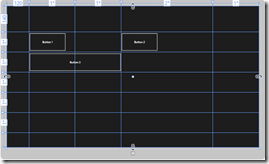
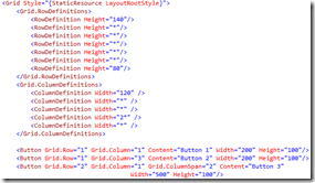
Controls can be placed into this coordinate system and the attributes ColumnSpan and RowSpan will allow to place controls over multiple cells in the coordinate system.
StackPanel Control
StackPanel automatically places controls next to the previous control. The orientation can be either horizontal or vertical.
See the usage of Margin to specify a left border of 120px.
Margin attributes can be given in any of this syntax:
Margin="30" will create a gap of 30px to every side
Margin="30,50" will create a horizontal gap of 30 and a vertical gap of 50 px
Margin="left,top,right,bottom" will allow to specifiy the gap for every side of the control.
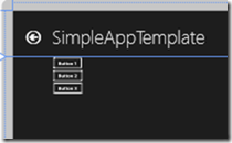
After you have the screen like it is shown below, then change Orientation to "Horizontal" for a short test!
Canvas Control
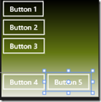
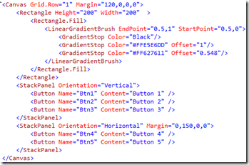
Canvas control is the simplest container, which does not adjust the position of the new control according to the previous control. Each control must be given a margin attribute, so that it is not overlapping.
In some scenarios it is wanted, that controls overlap, e.g. placing a rectangle around / behind another control as in this example:
